

A Color Hack
Part 2 on how I think about color

Hey! My name is Jacob Souva and I’m an author-illustrator of books for children. I write this newsletter as a way of getting better at writing and sharing what I’ve learned <waves hands at art, kidlit, creative practice, growth mindset> along the way. I’ve faithfully written a post every week since launching Drawing a Blank last July. Just about every 4th post is a paid subscriber only post. This is one of those posts! I’d love to have your support by becoming a paid subscriber. If you’d like to read more before jumping in, I’ve plucked some of my favorites from behind the paywall and placed them here.
Ahem, now to share with you my greatest color (colour if you’re so inclined) hack.
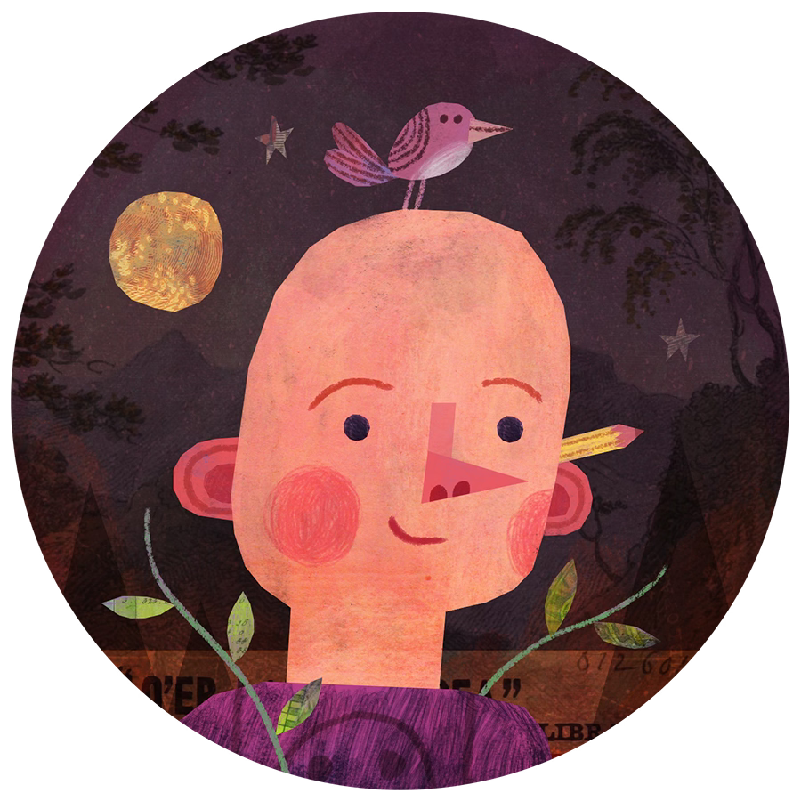
In part one, I talked about some color principles that I’ve found really helpful in my career as a children’s book illustrator. I sneakily left off my favorite mostly because I like to be mysterious. But also, of all of the skills involved in illustration and art making, color feels the most like magic to me. It’s the one that feels the most intuitive. So talking about it feels a bit like explaining how the rabbit got into the hat or how I knew that your card was the ace of hearts.
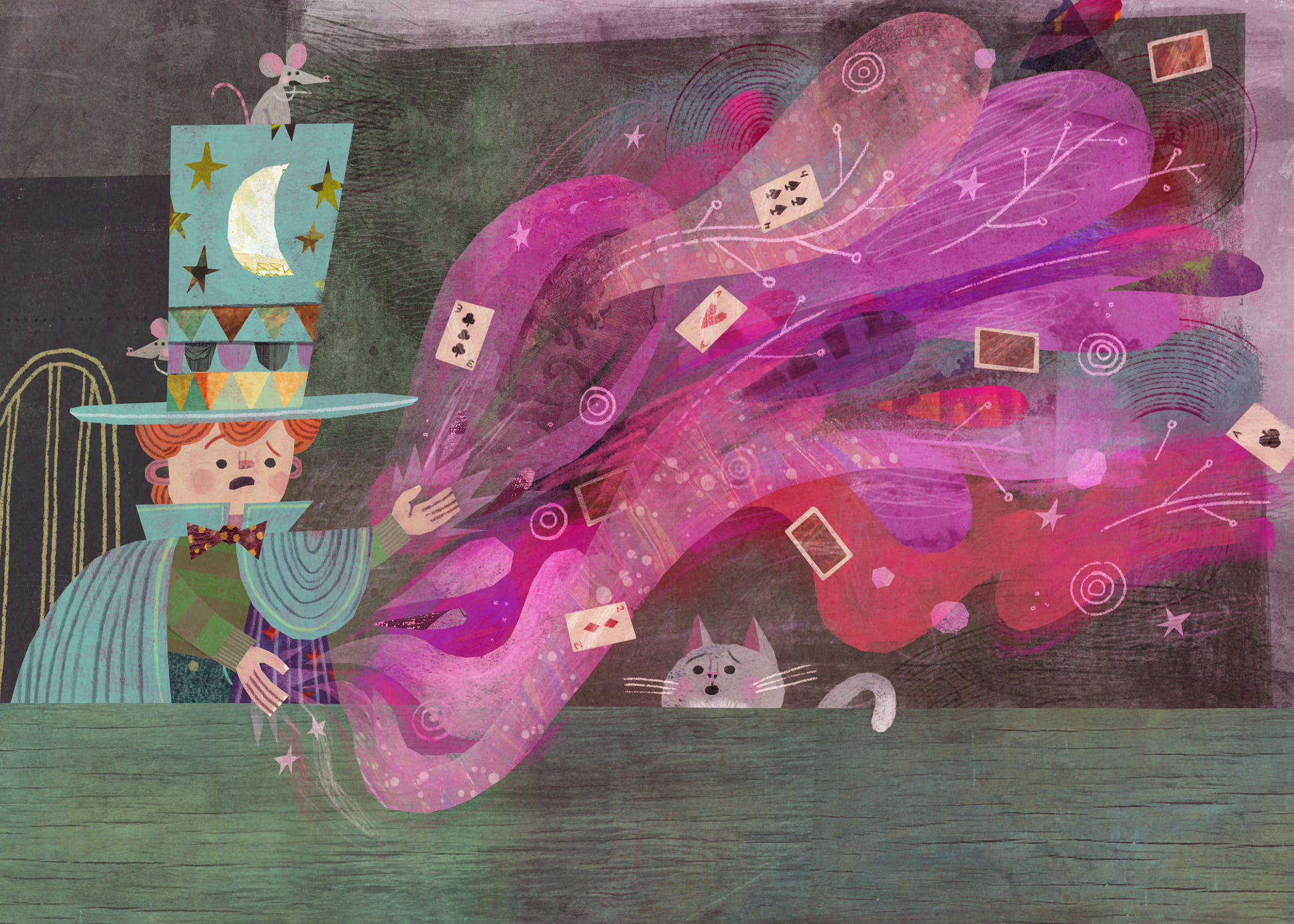
The principle is simple: When you choose a color and place its complementary color next to it, they create a visual tension. There’s a vibration, an energy to them. Here’s what I mean:
